
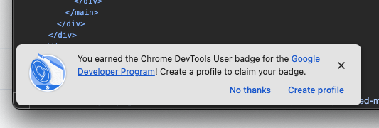
I’m trying to inspect my HTML, I couldn’t care less about achievements.
Another reason to use Firefox, in case there weren’t already enough.
I’m trying to inspect my HTML, I couldn’t care less about achievements.
Another reason to use Firefox, in case there weren’t already enough.
Most people think Salesforce has been designed by the Devil himself. I’m one of those people. They can’t even get their “Settings” page right… and a basic control panel isn’t exactly rocket science.
In the Salesforce settings page, you can switch between the different sections only by clicking precisely on the words, not anywhere else; even though the whole row gets highlighted, as if it was a big button.
Two things irk me: the highlighting feelks like an affordance, while it’s not; and the precision needed in order to click on the words breaks Fitt’s Law.
Good job, Salesforce.
The job of a date picker is to let you pick dates, simple as that. Apparently, the Android system date picker doesn’t let you pick dates very easily.
On a stock Google Pixel, open the Contacts app and try adding a birthday to a contact, including the year. If you manually type the year and then press OK, the year won’t be actually selected, reverting back to the default one (i.e. the current year).
There’s no way to get the year you want to save, unless you tap on a different input field before pressing OK (you must tap an input; just tapping outside doesn’t do anything either).
I wonder how many people saved wrong dates because of this clearly unpolished UX.
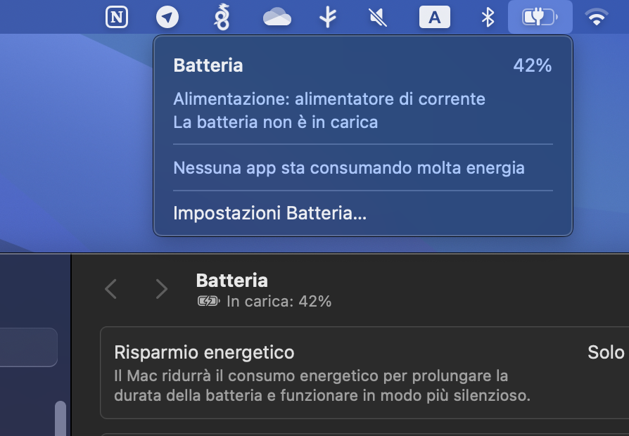
MacBook Pro. The battery icon menu says “battery not charging”, the Settings app says “charging”.
One of them must be confused.
What’s a changelog, you may ask? Wikipedia says:
A changelog is a log or record of all notable changes made to a project.
Do you remember buying software on CDs in brick and mortar shops? Well, when a new version of a program came out you could read about all the new features on the box.
Nowadays we have digital stores for apps and games. Both Google Play and the App Store have a changelog section for each new app update, but unfortunately it’s rarely used for its intended purpose.
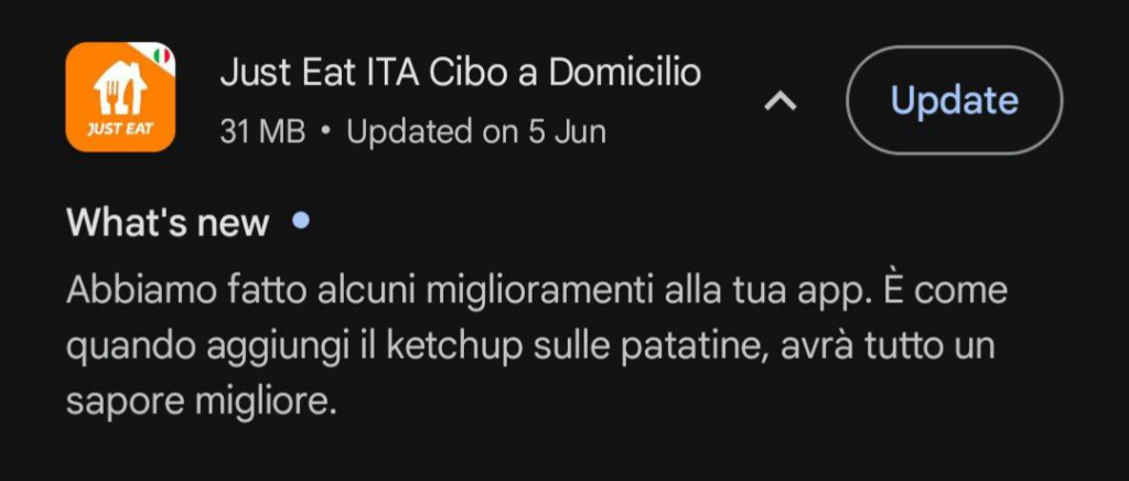
A random example: the Italian Just Eat app is joking about putting ketchup on fries. Wow, so funny.
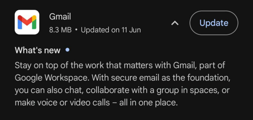
Google itself apparently doesn’t know what a changelog is.
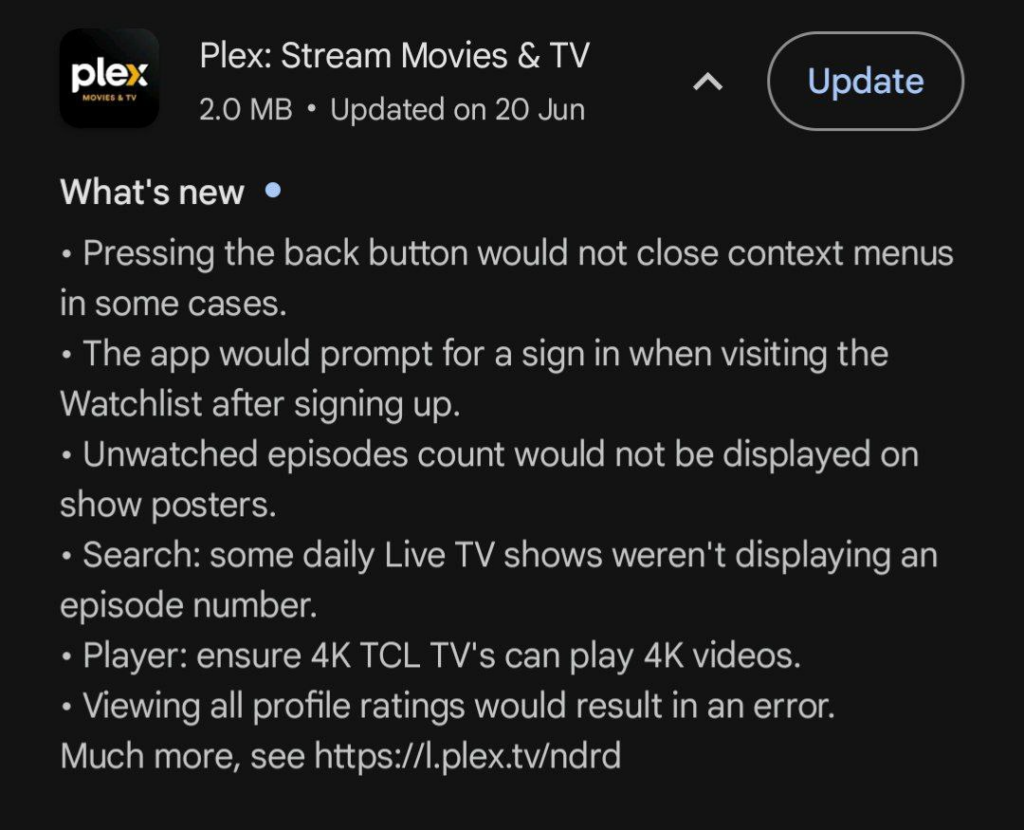
I’m mildly angry, but let’s see an example of a good changelog. The Plex app clearly shows all the new features and all the bug that have been fixed.
This is how it should be done.
The App Store isn’t exempt either. Apps over there have similar useless changelogs, even though it’s specifically forbidden in the App Store guidelines:
Apps must clearly describe new features and product changes in their “What’s New” text.
I use an Android phone. Google Play defaults to automatic updates, and I don’t want them.
I care about changelogs (more on that later), and I want to decide which and when apps should get updated.
Luckily, Google Play has a toggle for auto-updates. But as soon as you turn them off, a persistent and annyoing banner will appear in the “Pending downloads” screen.
You can’t close the banner, it doesn’t even scroll away, it’s just there.
And don’t even get me started on the wording of the banner itself: “You will lose your right to make legal claims”.